13-10-2017
Just like every year, our preparations for Dutch Design Week are still in full swing. And with just one day to go, we’re still completely in the dark about how things are going to turn out. For all we know, the taste we’re giving you in this DDW newsletter may never be more than that; just a taste.
Pulling out all the stops wasn’t our intention this year. Now that the eleventh hour has arrived, however, it turns out that there’s a lot more to realizing our vision than we thought, both when it comes to the work itself (which explains why we’re uncertain about whether our plans will succeed) and to its impact. After all, the process of creating space for our new ideas and products involves nothing less than a complete overhaul of our showroom.
I drew a series of products for DDW last summer, which you’d think would give us plenty of time. But with the amount of commissions we received and the few minor setbacks we experienced, time seemed to go by twice as fast, and here we are again.
Old inner-chamber vases and IKEA
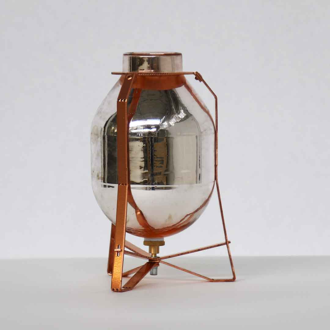
As of this moment, exactly one project has been finished: a series of ‘old inner chamber vases’. These beautiful, double-walled thermos jugs had been gathering dust in Jeanine’s workshop, and later in our basement, for years. I don’t know exactly how it happened, but one day Jeanine decided that they were bad luck and they had to go. I’m not superstitious, so I thought I’d take them to the office to solve the problem and turn the silvered inner chambers of the jugs into vases. We developed a system that would allow us to produce frames for the vases, in different shapes and sizes, relatively easily. Production will stay limited to the 44 pieces that we have now, which come in 16 different shapes.
We found those jugs years ago, in a large property that was set for demolition. The owner of the building had also been the proud owner of a huge china shop in Eindhoven’s city centre. He spent his final years living in crumbling buildings and eventually died next to his stockpile. His son was nowhere to be found – maybe that explains Jeanine’s superstition. The buildings were auctioned, and a friend of ours bought a number of properties and their contents. The vases still have the kind of grandeur suited for the porcelain palace they were once purchased for.

It’s undeniable that the collapse of the old economy, in which tradespeople were able to collect the most beautiful sets of china from all over the word and sell them, was caused by globalization. Mass production and logistics have supplanted small businesses everywhere. When it comes to interior design, IKEA is the most famous, most notable and perhaps the only example of that. I’ve often said that we live by the grace of IKEA.
We’re not a big company. Our collections are produced on a small scale, and our products are often custom-made or one of a kind. Mass production has created a need for singularity and individuality. But small-scale production is expensive, and what’s more beautiful than creating something that’s affordable and available to everyone – and working with wonderful people while you’re at it? When I met Karin Gustavsson at the Salone del Mobile in Milan, we both became more and more excited without having a clear goal in mind, so we just started working together. I ended up designing furniture for IKEA. Karin and I just clicked, and we still do.
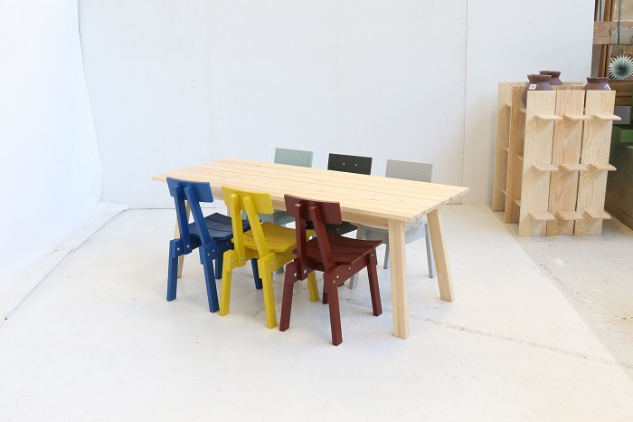
The Industriell collection won’t be launched until next spring, but the first models and prototypes will be presented in our gallery during DDW. The most important theme of the collection is ‘handmade – serial produced’, and it will feature products that have been crafted in large quantities, but which still have a handmade feel.
Another theme was ‘do not throw away’. If you produce 35,000 cabinets, and sawdust is the only thing you end up throwing away, that means there’s a lot of waste you’re not throwing away. Using 100% of the materials is an ambitious aim for us, but for IKEA, with its mass production, it makes a huge difference.
Finally, we’ve created a line of products that involved commissioning craftsmen and factories whose survival depends on their sales. Some of these factories struggle because their sales hinge on the whims of the market. To provide these factories with work, we designed a collection of furniture made of solid pine, a material that is hopelessly out of fashion. Our DDW 2017 IKEA-Eek presentation will tell the whole story. Not only will we be presenting the products, but the process, the setbacks and the story behind the collection will also be shared. Those who love to read will be happy to learn that we’ll also hand out a booklet that gives you a glimpse behind the scenes.
Please click the following link for the full IKEA story.
RAG table and lamp
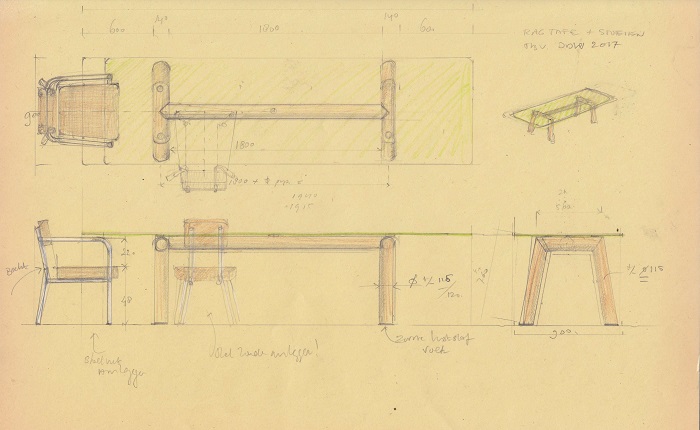
The RAG building, which I designed with Iggie Dekkers and which will hopefully be rewarded with a prize during DDW (although the chance of us having to stand by and watch as someone else runs off with that prize is just as big) has lent its name to another series of products. The RAG tables and lamps are all one of a kind, crafted from old pipes from the building.
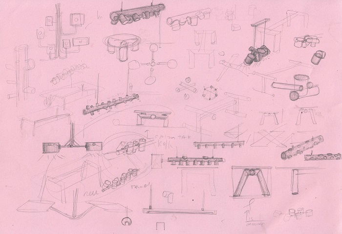
For this year’s DDW, we built a rectangular table using pipes that are just short of enormous in diameter. We’ll also be making a lamp, possibly with a small tableau inside. In any case, the lamp will have a futuristic, Barbapapa-esque look. When I drew it, I didn’t know that later on, we would purchase a number of ceramic lamps at an auction. Those ceramic lamps, and many other objects we selected, will also be featured in the presentation. This may sound like an advertisement, but it’s all true. I can’t tell you exactly how weird the lamp is going to be, because we’re still welding it.
Ceramic lamps, authentic design
Thankfully, we also have a few actual designer products that would delight any serious designer. You know, someone who works with new materials and produces in large quantities in order to keep the cost down. These ceramic lamps might as well have been made out of plastic; they’re simple products, whose design is barely worth mentioning. At one point I remember thinking: how have these lamps not been around for years?
That’s a good sign these days. Every now and then, we create small products that keep selling. I don’t know if it’s because our company has grown and we’ve become more widely known, or because our designs have become better, or just because we’re lucky. In any case, I have the same feeling I get with every new design: that people are going to like these lamps, and that we’ll be able to keep them reasonably affordable. Who knows, DDW 2017 may just give birth to an Eek staple!
Oak display cabinet on legs
It wouldn’t be the first Eek staple, either. A number of products have been a part of our collection since the company was founded. Among them is the classic scrap wood cabinet that I made as part of my graduation project in 1990, and which still sells extremely well. It’s worth mentioning that we finished a number of these classic pieces just in time for DDW.
Another classic is the oak display cabinet, which I designed in 1993. It was inspired by a pallet with old square sheets of glass that I found at a Philips outlet, which existed because Philips was in the process of shutting down its production plants in Eindhoven. These days, only a number of divisions of Philips have their headquarters in Eindhoven, and the old Philips buildings are home to us and many others.
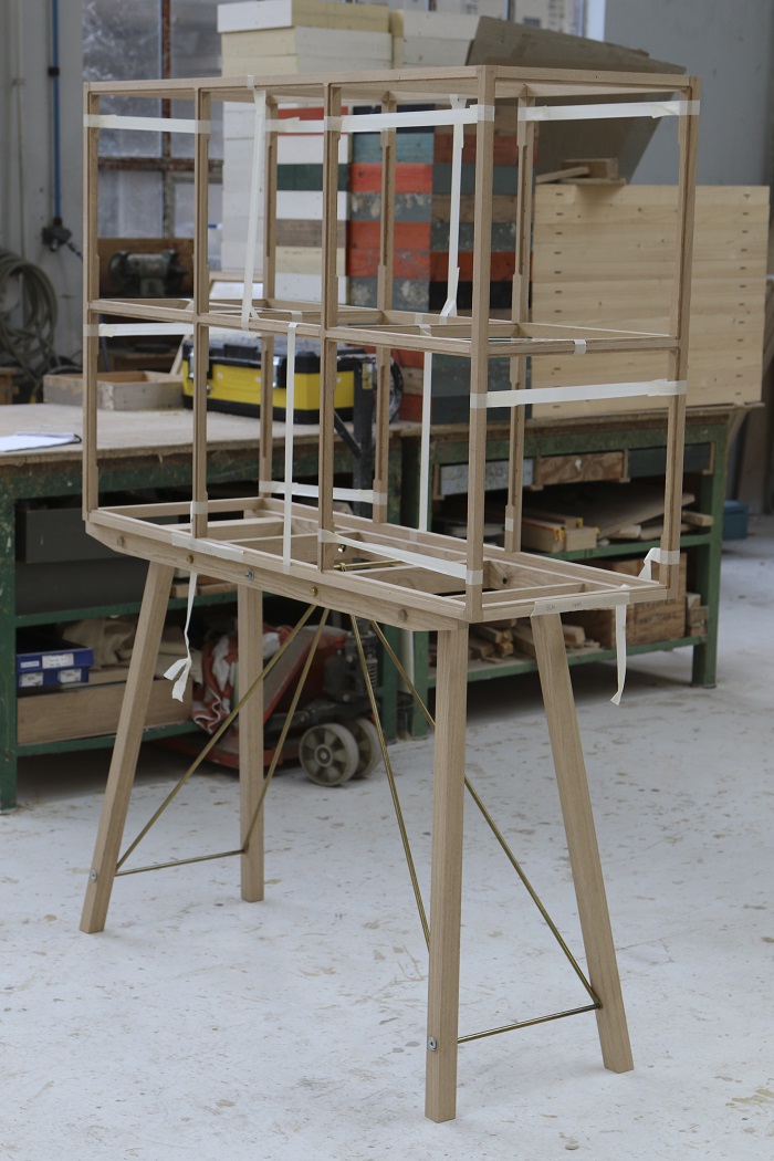
Later on, it was added to the collection with rectangular windows. It’s been one of our best-selling and most distinctive products ever since. Almost 25 years later, we’re introducing a new model to our collection of oak display cabinets; a cabinet with square windows like the very first model, this time on legs.
NYC water tower wood, with Diederick Kraaijeveld
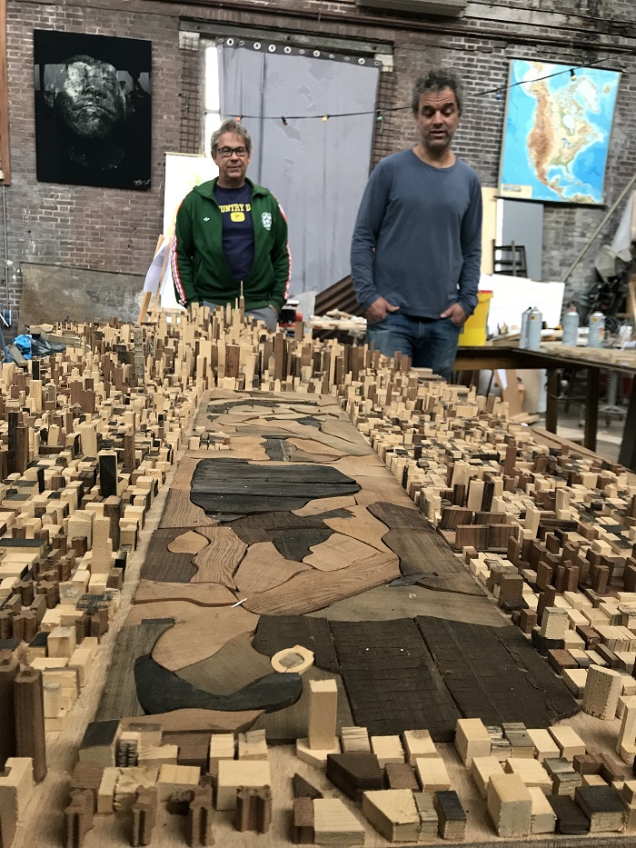
The wood from water tower reservoirs in New York that we bought over a year ago with Diederick was used for a collection of water tower furniture last year. This year, we’ll be presenting our original plans for the material, among other things. Diederick had been coming here for years, and we gradually started talking more and more. At one point, he suggested that we bring a container of water tower wood, which would otherwise be thrown away, to Eindhoven. He’d use his share for his collages, and we’d use ours for furniture.
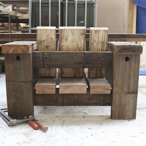
Much like our scrap wood furniture, Diederick’s collages are made using old wood. The difference is that he uses his wood for figurative art. Now that I think about it, his work has a mostly American theme. His work features sneakers and other objects that are quintessentially American, but he also makes portraits of Barack Obama and other celebrities. More than once, we discussed making more abstract works; I suggested landscapes and pure compositions as subjects for collages. Thankfully, the people around me are just as headstrong as I am, and Diederick just does what he wants. He used the wood from the water towers to create a scale model of Manhattan that is as figurative as it is abstract, so we both got our way in the end.
Diederick has a quality that hardly anyone else possesses. He establishes contact and makes friends like it’s the easiest thing in the world, and he will travel anywhere. That’s how he came by the water tower wood, and it’s why he has so many other contacts in New York. He asked one of those contacts, a friend who’s a well-known photographer, to take photographs of water towers in order to illustrate the story. These photographs would become part of the exhibition and complete the narrative. Or so I thought.
A few weeks ago, Diederick sent us a picture of a number collages that he had made, depicting water towers. More figurative work, then. These collages resemble Bernd and Hilla Becher’s photographs of old, industrial buildings rather than Diederick’s own previous work, and they’re somewhere in between abstract and figurative art. As the project’s initiator, it’s Diederick who has the final word. For now, anyway.
Enorme balkenvazen met Royal Leerdam Crystal
Enormous beam vases in collaboration with Royal Leerdam Crystal
We’d already been in touch with Royal Leerdam Crystal on account of the beautiful Copier vases that are currently in production, named Copier Revisited, and that we carry in our shop. Years ago, I visited Royal Leerdam Crystal to talk about the possibility of doing a project that involved using their waste glass. That project never happened, probably because we were all too busy. This time around, we felt like we could really do something together.
During our talks (for which Marco Lopulalan, their master glassblower, was also present), we said to each other that if a good idea came to mind, we should just do it. A few minutes later, I thought that it might be nice to use the scrap materials from our beam furniture to make an open mould for Marco to make mould-blown vases. The glass is blown into the mould, determining the vase’s square shape. Because the mould is open, however, the glassblower can get creative with the top of the vase. The latches on the sides of the mould are lifted at just the right time, causing the sides to fall away so the square vase with the free-form top can be taken out.
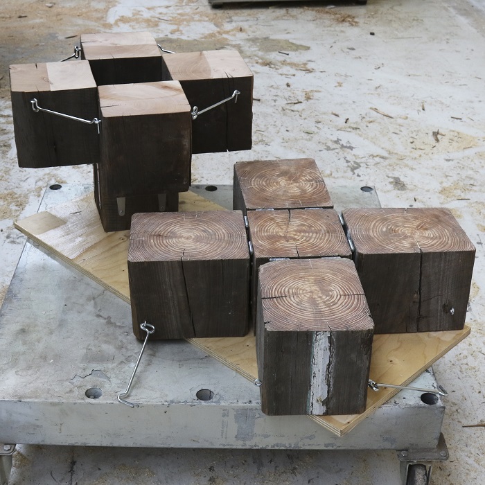
The mould is made of wood, and it burns a little more every time it’s used. We expect (and we’ll find out if we’re right soon enough) that it’ll leave an increasingly higher relief in the glass as we make more vases. The idea was to use each mould to make nine enormous beam vases. Marco seemed to believe we’d succeed, and he was excited about the project from the get-go. That’s why we decided to try to finish our first series of vases before the beginning of DDW, in less than a month and a half, and to present the vases along with their charred moulds during DDW. So far, we’ve produced two prototypes, one of which didn’t survive transportation.
When Marc Mulders saw the broken pieces of glass, he loved the result and the imprint of the wood in the glass. He was more than happy to take the pieces home, and he’ll use them for a new piece of glass art. If that’s not recycling, I don’t know what is!
Christie van der Haak
Our first collaboration with Christie goes a long way back. Our current collaboration is characterized by strong-mindedness on both ends, and trying to keep up with her is hard work. My job is to think of ways to display Christie’s (not to be confused with the auction house!) textile designs, which have an otherworldly element to them.
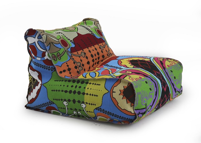
The first time Christie contacted me, she asked me to design a piece of furniture to be upholstered in the fabric she was designing for the Textile Museum in Tilburg; I think it was Menno Doornbos who introduced us. This time, however, it was the other way around. We still had a piece of fabric lying around from one of the couches we’d upholstered for Christie. We were making beanbag chairs at the time, one of which was upholstered with a tapestry, and I thought: why not use Christie’s fabric for one of those beanbags?
I sent her an email to see if she was OK with it, and she was. The beanbag turned out quite spectacular. Its design is relatively simple, which makes it a great medium for Christie’s rich fabrics. We’ll be presenting a beanbag, a lounge pillow and an ottoman upholstered in the fabric Christie designed especially for this purpose. As I’m writing this, we’re still in the middle of the cutting and sowing process. That means I have no idea what the final result will look like, but there’s no doubt in my mind that it’ll turn out great. By the time you read this, we’ll probably have added pictures.
Watch here the video (only in Dutch) where Christie van der Haak talks about here textile and the production process.
Old school products and trinkets. Oak armchair and table, tile cabinets and candlesticks
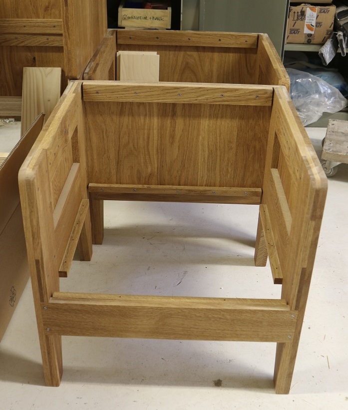
In addition to our new products, we decided to take a number of products out of storage. We saw an increasing demand for a table and armchair combination we designed for the Verkade factory, so we reintroduced it to the collection. The armchair’s appearance hinges on the right combination of leather and oak. Thankfully, we’ve been working with ECCO Leather for a number of years now. They can make just about any type of leather we want, which makes producing these armchairs even more fun. Whether they’ll be able to produce the right type of leather in time is still up in the air, but the armchairs have already proved their worth.
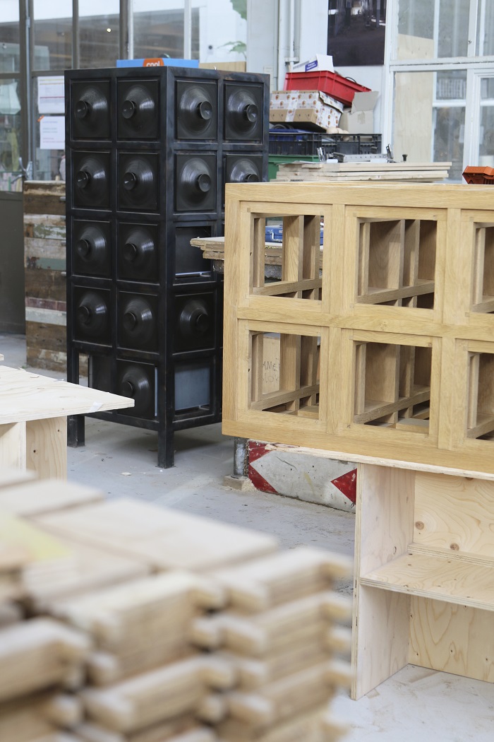
The tile cabinet was also designed years ago, and it’s still one of the most exclusive items we’ve ever made. The last series we produced featured an all-black version made of steel, of which we have only one left in stock, and a version made of wood and white ceramics. We still had two frames to reproduce the latter. That left us with the tiles; a welcome opportunity to burden our ceramics studio with a little extra work just ahead of DDW. As if they weren’t operating at full capacity already.
When I designed the cabinets, they were the perfect example of how to create complex structures out of simple details. In order to produce the cabinets, we had to make every small part separately, and then combine them all to determine the shape of the final product. It was an extremely complex puzzle. So much so that I started referring to the process as my ‘puzzle phase’, a period of time that culminated in those tile cabinets.
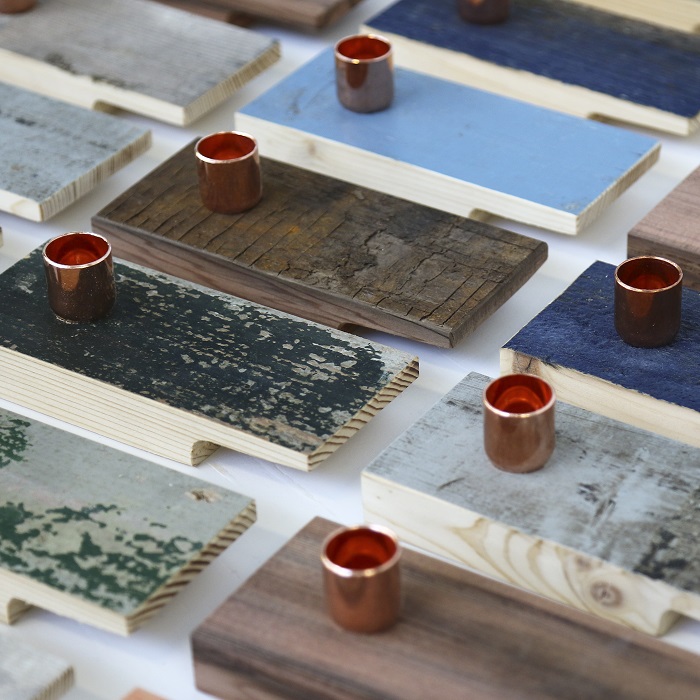
A lot less exclusive and barely worth mentioning are two candlesticks we tried to design for a client. To make a long story short, they had to be dirt-cheap, and because the client was located abroad, we had to be able to send them by mail, in boxes. These two candlesticks belong to the same family; they’re both based on old-fashioned chambersticks.

Adding even more models to our already huge collection of candlesticks isn’t the smartest thing to do. However, it was the only product I could think of that could be shipped in boxes and produced at a low cost. Whether that cost is still low after we’ve done all of the calculations remains yet to be seen. There’s a reason that I often joke that we can make the price of lumber skyrocket just by looking at it, all thanks to our labour costs.
Our collaboration with Carhartt
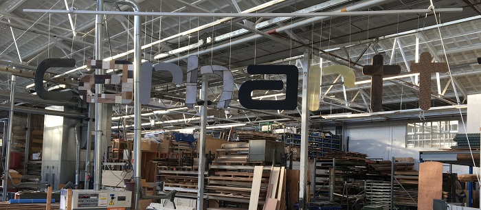
The biggest change in our shop is that we started carrying clothing by Carhartt. Over the past few years, Carhartt has commissioned many objects for their shops and presentations. We want to start collaborating more closely by selling their clothes, and maybe even designing a few pieces for them. We put a huge beam display table and a fitting room with a mirror in the shop to accommodate the brand.
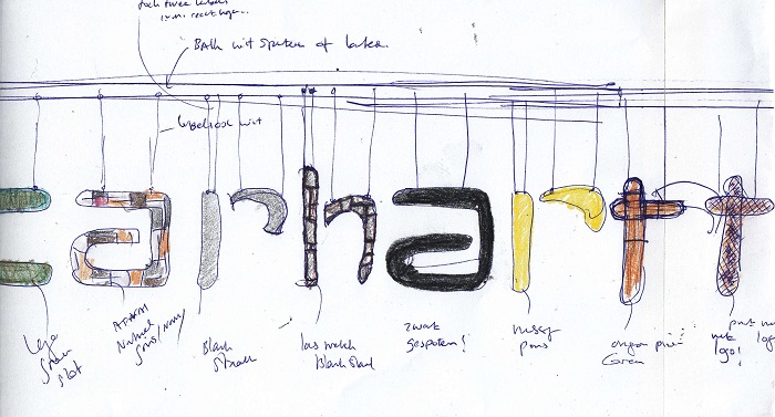
But the best part is the video my eldest daughter Lieve made for us with the help of a few of her friends. Carhartt at Piet Hein Eek, I guess you could call it. It’s footage of us sowing, welding, milling, spray-painting, putting together, glueing, tacking and suspending the letters C A R H A R T T in our workshop. This is the first time someone’s made a video that shows so many of our in-house techniques.
The worst project. Renting out new studio spaces
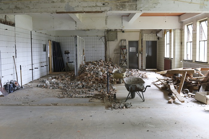
Every year, I say that DDW isn’t the be-all and end-all, and that we shouldn’t let ourselves get carried away. And every year, we fall into the DDW trap again. This year, our pitfall was the plan to rent out studio spaces at the front of our building on Halvemaanstraat. The part of the property that’s currently being converted into studio spaces had previously been used for storage. Really, it had become more of a landfill for valuable possessions. Whenever someone owned something they didn’t know where to put, they simply brought it here, closed the door behind them and never thought of it again. While cleaning out the space, we found lots of rubbish and lots of extremely valuable things.
Our main reason for renting out this part of the building was that it was rather dead. Nothing was happening, and we thought bringing in new tenants and giving them each their own front door would solve the issue. Finding the tenants was easy. While they were flexible, they indicated that they’d appreciate (really appreciate) being able to use the space by the beginning of DDW. So once again, we have a mission impossible on our hands; one that we have to complete. And like all of the other things we’ve let ourselves in for, it seems that we just might succeed in doing it.
Veronese in our showroom
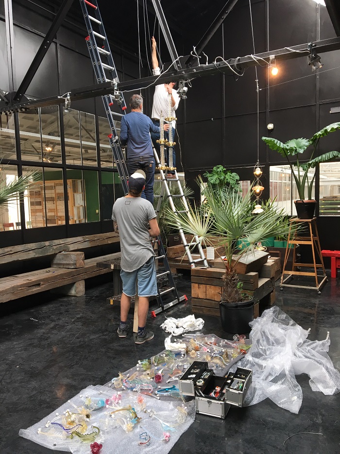
After the Salone in Milan, where showed the Veronese chandeliers at Rossana Orlandi, they will also be shown in our showroom during the DDW.
Veronese is a company that has been making chandeliers and fixtures from Murano glass for almost a hundred years. The son of the family business was brooding for years over a plan to breathe new life into the history of the brand, stored in the basement of their premises in Paris. It was my greatest fortune that he thought it logical to invite me to do something with these treasures. In the small cellars lies an incredible amount of chandelier ornaments from days gone by.
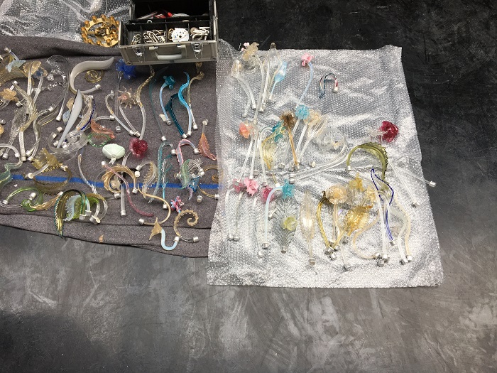
All I had to do was think of something to compose from this glass. It became a kind of meccano system around a vertical axis, allowing you to create all kinds of different objects. The first results were presented on November 16 at Merci in Paris. I saw the light objects there for the first time and they exceeded my expectations. But even better was that they instantly served as a source of inspiration for all kinds of other ideas – exactly as we had thought and hoped.
One of the guests mentioned that the design and construction of the lamps was completely new, but could also have been created a hundred years ago, although it would then have been unthinkable that equilibrium could be found both literally and figuratively through the combination of random and asymmetrical elements. The advantage of the design is that if a component should be broken, it can be replaced by any other component without disrupting the design. There remains a treasure of thousands of pieces of unique glass at Veronese, just waiting to be used.
This post is also available in: NL
« Back to blog
